
RHODES is delighted to introduce Camilla Perkins - an acclaimed British artists and illustrator, based in Lewes, East Sussex. With a passion for fine art, she explores the profound impact of colour on memory, transforming her creations into portals to dream-like landscapes of summer getaways and emerald gardens.

We had a unique opportunity to talk with Camilla and find out more about her style, creative process and influences.
What is the starting place for your work? And how does the process of creation usually look like for you?
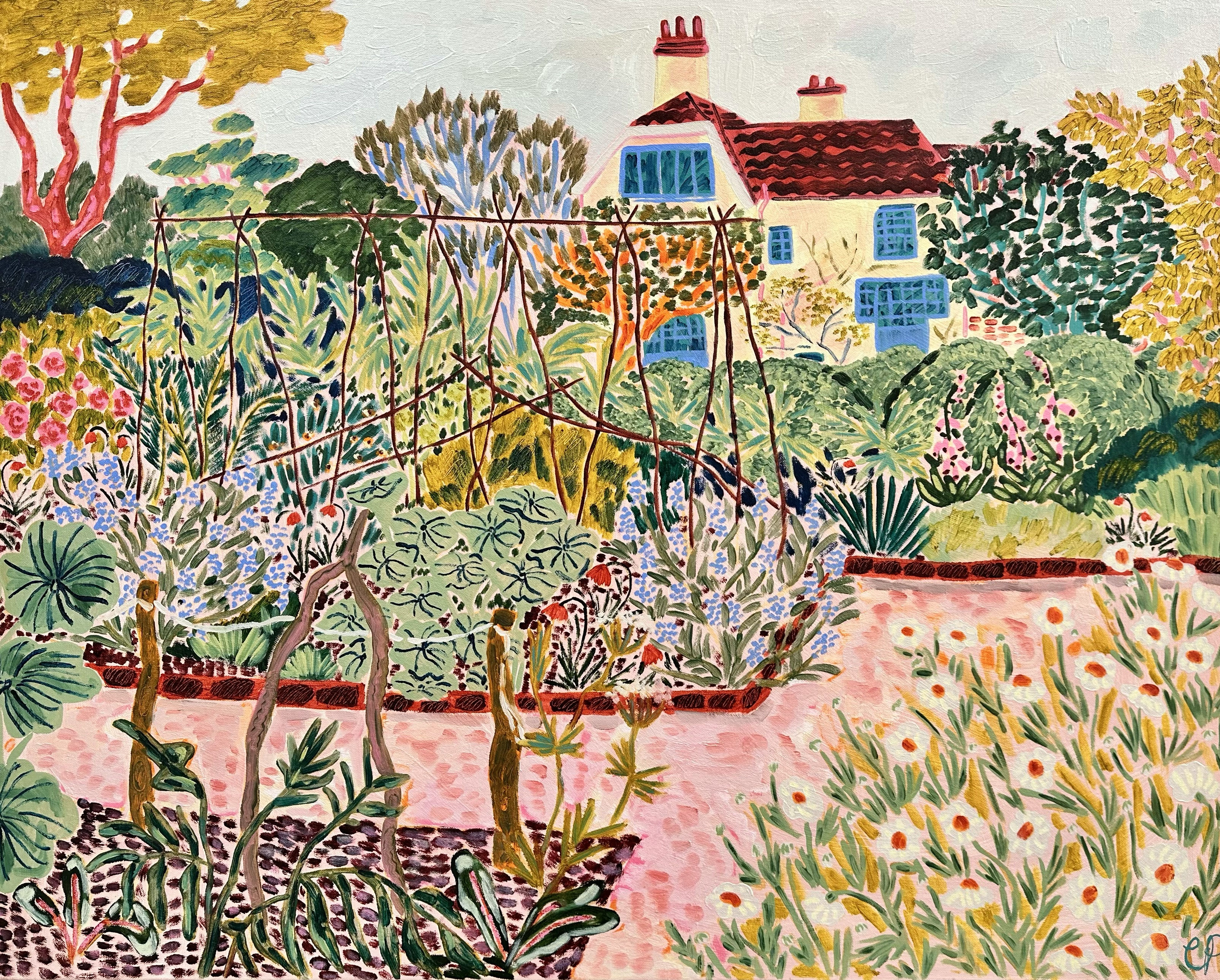
I often start my entire creative process by asking myself “where would I like to be right now?”, it could be swimming at a lido, reading a book by the sea, or walking down the path of an overgrown garden, I just use the idea as the starting point and go from there. Colour is incredibly important within my work so I’ll usually base a piece around a palette that I’ve created rather than what exists in reality. I take lots of photos of places that I find beautiful or make sketches in oil pastel thatch then be translated to larger pieces, more often than not my paintings of gardens will end up being a combination of lots of different elements that I’ve collaged together to create my perfect scene.
What draws you to the mediums you use?
I love the instant burst of colour that you get from using oil pastels, the physical size of the pastels themselves also force you to be more expressive and I really enjoy the lipstick-like texture. The finished works almost look like embroidery against the paper. When creating pieces on linen or canvas I work in oils, I also use a layer of flashe as my ground so I think the contrast between the matt texture of the flashe and glossy oil paint is really beautiful.
What kind of themes do you explore in your creative practice?
I’ve always been drawn to the idea of bringing the outside in and trying to capture those moments of serenity you find when being surrounded by the natural world. I often focus on specific memories in my own life when I’ve felt overwhelming happiness, usually the last halcyon days of the summer and then try to recreate that feeling on canvas. I like to feature little intimate moments between the figures that aren’t usually seen, a hair cut on an allotment or an embrace hidden behind a tangled mess of orchids.
How do you choose the colour palette for your paintings?
Colour is just something that has always come naturally to me, I like how putting colours together is like a really exciting puzzle that can completely change the mood of the painting depending how much or how little you use. I think that having a background in design has really influenced how I approach my work, I often use a limited colour palette which I think gives everything a more cohesive feel and creates balance. You’ll always find pinks and greens in my pieces, they’re my neutrals!

What experience do you hope the viewer has with your work?
I’d like the viewer to be transported back to a moment of joy and tranquility, the idea that you could almost step inside the canvas and be part of that world within the painting. It’s increasingly hard to find these moments of simple pleasure in a fast paced society where people are overworked and exhausted by the pressures of modern life, I’d hope that my work could remind the viewer to take a breath and create a moment of calm amongst the chaos.

For more information, please email info@rhodescontemporaryart.com
